The Business Lioness
Today, I am beyond excited to celebrate the recent launch of The Business Lioness! Earlier this spring Nancy approached me regarding her rebrand and web design for her London-based coaching business, Nancy Florence. Nancy’s mission is to empower women entrepreneurs in creating their dream business & life. She helps those who are struggling to feel good within their business due to a lack of clients, which makes managing their time and money difficult. She helps them create their own clients, up-level their income, stepping into their zone of confidence, and improve their relationship with men.
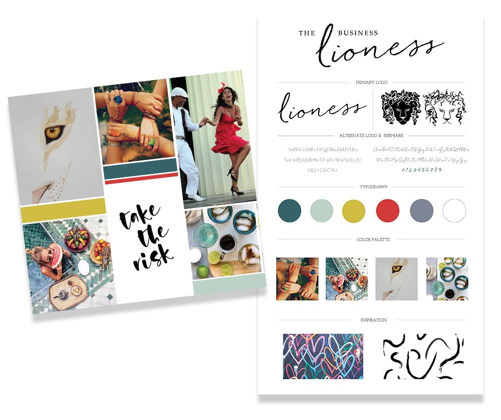
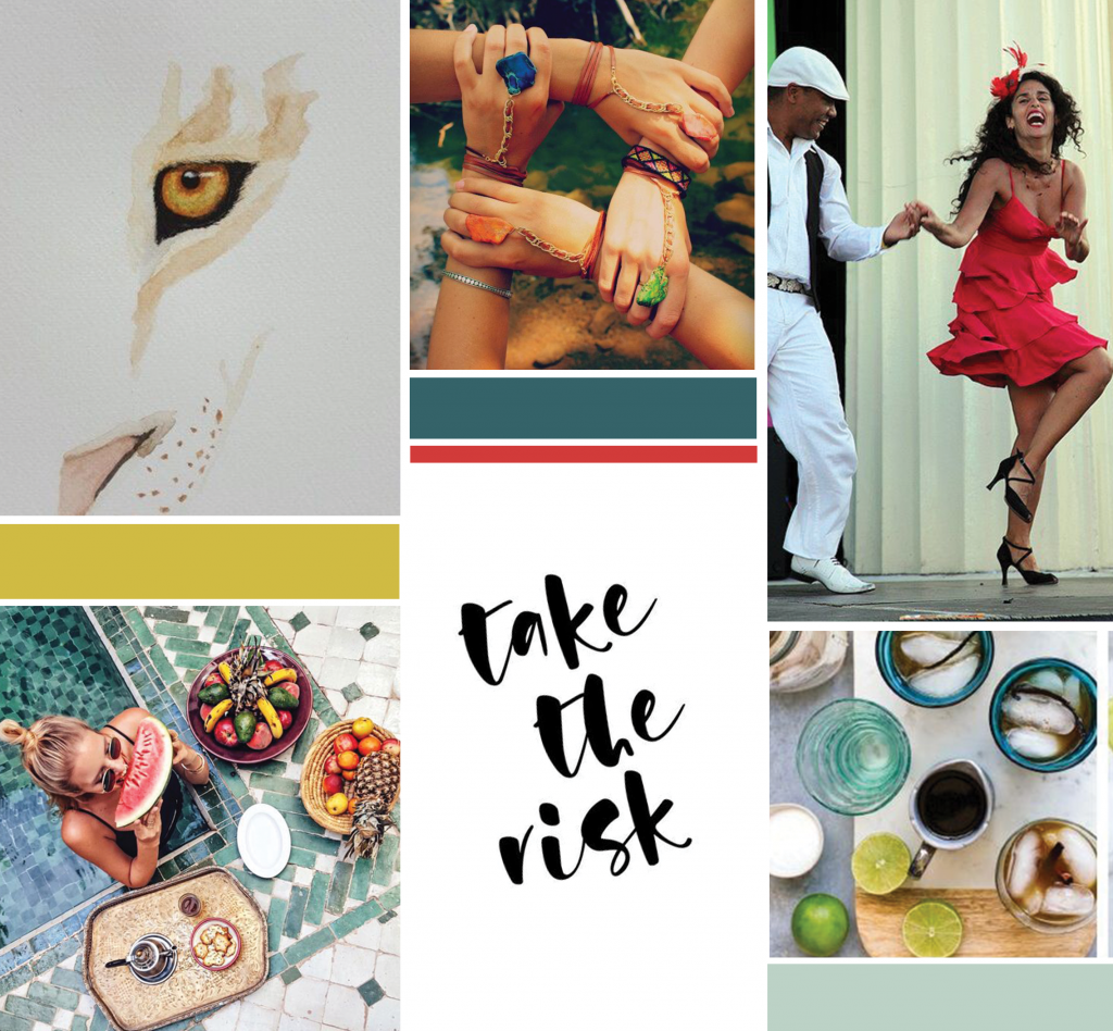
Nancy wanted her brand to evoke the feeling of being clean, free, authentic, full of integrity, love, and support – all with an edgy side. I am so excited to share more about The Business Lioness as well as the design process below.

The design process started with a comprehensive questionnaire for Nancy to go through and really dig deep regarding the vision for The Business Lioness. Some of the questions included detailed information about the overall aesthetics, ideal clients, and future goals.
DESCRIPTIVE WORDS
- Radical
- Freedom
- Love
- Authenticity
- Pleasure
- Warmth
INSPIRATION

Once the mood board was designed and approved, I started on the logo design. Nancy had a vision of a lioness submark that she wanted to pull into her brand, so we obviously needed to bring that to life because the idea was truly brilliant. Together we worked on creating the design concept for her beautiful new logo and pulled an illustrator into the project to create her lioness submark.
COLLATERAL ELEMENTS
Nancy does not use business cards, so instead of designing new cards for her so we focused more on her social media presence and the different elements so she was covered from the ground up. We designed social media graphics for Facebook and Instagram, an email header and signature, an invoice template, and a handful of beautiful new newsletter templates and launch graphics to ensure that every piece of her brand was on point.
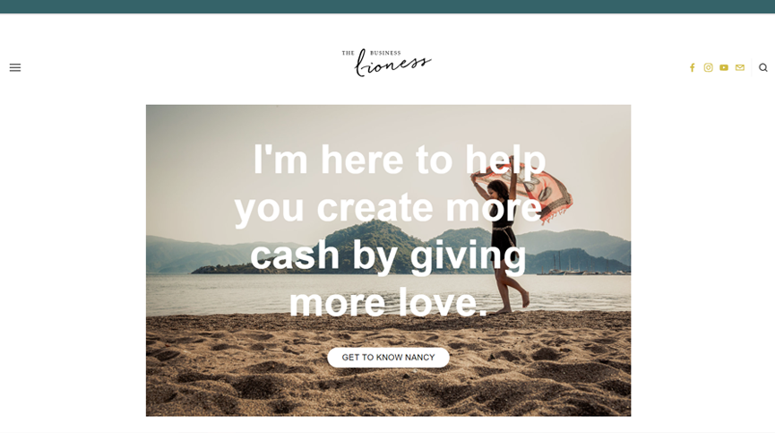
Her website – oh her website. This was the first website that I have designed in Squarespace in some time and I forgot how much I love that platform. I am seriously in love with so many things about this site. From all the beautiful photos that Nancy was able to take in a recent trip to Turkey to some of the fun and simple touches throughout the site. I just love how it all came together in the end! Be sure to check it out for yourself!

It was such a pleasure and a joy to work with Nancy on rebranding her business and helping her take her business to the next level. I have no doubts that she is going to do incredible things with her own business and life!
