Create a Moodboard
Everyone loves a nice, pretty moodboard but many people do not understand why it is so vital to the design process. You can use a moodboard for any project that you need inspiration on – branding, wedding, house renovations, even birthday parties. But today I am touching on why I create a mood board for all of my brand designs, how I create them and how you can to.

A mood board is a visual interpretation of what you want your brand visuals to be. They guide you in a direction, as well as your designer, to the mood and vibe you want your brand to be. Before I start any of my brand design projects I have my clients create a Pinterest board and pin images that makes them think of their brand when they see it. I request things from the type of typography they are drawn to, colors, clothing, patterns, decorations, interior design, scenery, etc. All of these tell their own stories and once compiled you can sit back and actually start to see similarities throughout the pictures. You will notice the colors that are shown throughout the board, you will notice the overall feel and aesthetics of what is displayed. Is there more white space with light, soft elegant colors or is it more vibrant colors with a bold feel?
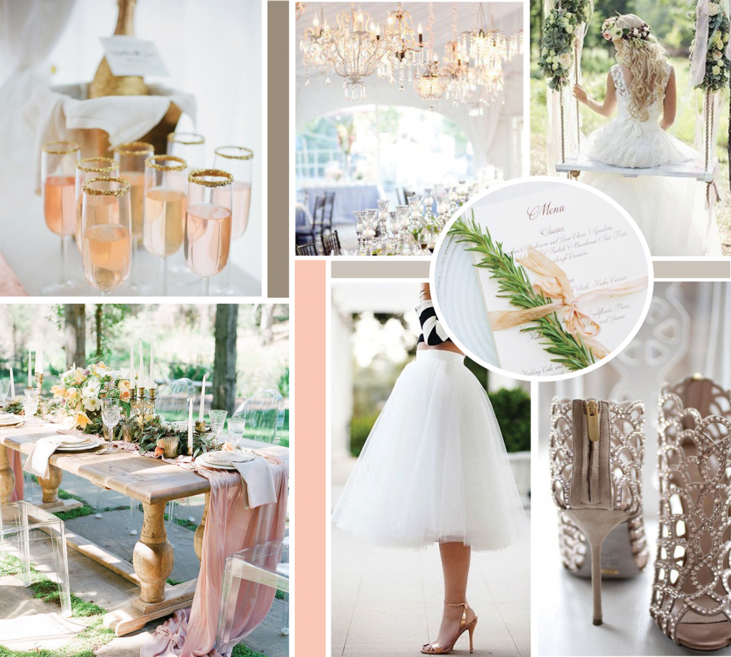
Here is an example of a mood board that I created for a previous client. Most of these images were pulled from her Pinterest board, but I always pull in other images that I find to create the most cohesive feel possible. I look at the most prominent colors and then start to pull them into the color sections in the mood board which creates their brand color palette.

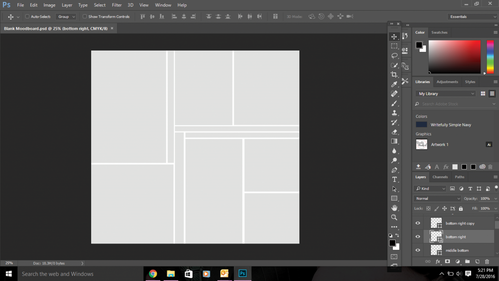
To create mood boards I use PhotoShop, which is my preferred design tool – unless I am designing logos than I obviously use Illustrator. To begin I start a new artboard. I use the rectangle tool to create rectangles and squares in different sizes that I want to use as placeholders for images and colors.

I then insert the images that I have saved by placing them directly above the layer/rectangle I want them to be shown in.
I resize the image and create a clipping mask, which is super easy. The easiest way that I love is by making sure the image that you want to go into the rectangle is selected. Hold down the Alt button on your keyboard and hover over the two layers (so on the line that separates the layers) and a down arrow and a white box will appear. When you see the down arrow and the box click your mouse. **You can also select the image > Layer > Create Clipping Mask
Play around with images, with colors, and enjoy the process. It can be a lot of fun and is one of my favorite parts of creating a brand for a client. Once you are completely happy with it, save it and use it to reflect on when you are working on your brand. It will help you stay on track when you are designing other elements for your brand, such as marketing materials, and welcome + thank you gifts.
Do you have a love obsession with creating a mood board, like I do? Of course, if you have any questions feel free to comment below or send me an email with any questions or if you’re interested in working together and let’s chat!


Are there any good moodboard templates for PS out there? I’d like to experiment a bit with my own!
Hi Alex! I am not sure of any off-hand, but if you’d like I can send you an older version of a mood board that I used when I first started doing them!?
Moodboard. Before reading the article i already get an idea what will be in the content & i just guessed it right. Great!