How To Use A Brand Style Guide
One of the things that I believe is so imperative to receive (or create) when you are developing your brand is a brand style guide. Many people overlook the importance of a brand style guide, or they simply have no clue what it is or how to use it. First, let’s figure out what it is. A brand style guide is your brand blueprint. It is a document that displays everything from your logo, alternate logo, colors, fonts, patterns and images that make up your brand. It is something that you can reference back to ensure that you are keeping your brand consistent.

Let me break it down for you so that you can start to use yours effectively.
MAIN LOGO
Your main logo should be at the top of your brand style guide. This logo will be used most often with your brand. You will find this logo on your website, and most of your business stationery. You should be provided with a color version (if your logo includes color) + a black and white version.
ALTERNATE LOGOS
Alternate logos are meant to be used in places that your main logo cannot fit, or when using a variation of your logo is preferred. Alternate logos are also known as sub-marks, monograms, or secondary logos. Think of it like your logo’s visual tagline or nickname, if you will. It’s a smaller version of your logo that can be used on things like social media, stickers, or stamps.
COLORS
This section specifies your primary and secondary brand colors. You should be provided with color values for each color, i.e. RGB (used for web), CMYK (used for print) and Hexadecimal. Your main brand colors should be used on your website and business stationery. The secondary colors should be used for blog and social media images, or small pops of colors where you use your main brand colors.
TYPOGRAPHY
Keeping your fonts consistent on your print and digital design is imperative to cohesive branding. It should include the name of the fonts used, plus I like to have it all laid out so that you can see what all of the letters and numbers look like in each font. I suggest having two or three different fonts for your brand.
PATTERNS OR UNIQUE DESIGN DETAILS
If you have a pattern, illustrations, or specific design elements in your brand it is important to also include this element on your brand style guide. You do not want to use it everywhere, as it can start to feel a bit gimmicky Some places that you can use your pattern on includes web buttons, or on your business stationery.
STYLED IMAGERY
Clearly defining the look of images that are to be used with your brand is crucial. By including images it helps remind you and other designers the aesthetic and quality of photography that the brand demands. Photography plays a huge role in your brand. By showing whether your imagery should be bright colors, black and white, clean, white space, or something else it will help everyone stay in line with your brand.
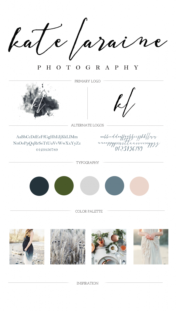
Here is a brand style guide that I created for Kate Laraine Photography, so you can have a visual.

You may not have all of these elements figured out for your brand at this time, and that is alright. As your brand grows and evolves, keeping all of this information on a single document will help you keep everything cohesive throughout the different avenues in your business. Are you in need of a brand style guide? Does yours go into more detail, and if so what do you have included in yours? I’d love to hear!
If you are interested in learning more about how to take your brand to the next level, or if you simply just need a brand style guide created for you let’s chat!


I always forget that patters and images are part of that. Now I need to go through my site to see if it all matches
Anung, it seems like patterns are often overlooked! Hope this was helpful for you!
These are great tips, and something I’ve been thinking about as I launch my blog. Thanks for sharing!
So glad these were helpful for you Malisa!
OK, so cool!! I will absolutely bookmark this and probably read it like 5 times. Never knew I needed it, but it makes so much sense! I had parts of this when I ran my own business, but not a centralized place to see everything. I think this will really help me identify my new brand with my new blog. Thank you!!
Ha, I am so glad it was helpful for you! It totally makes things easier for you and other designers that you may pull in for various projects in order to keep all the different elements stay in line with your brand! If you ever need any help, I am always here if you have questions too! Enjoy your night!
So much great information. I get caught up in the day-to-day of business and forget how important a cohesive brand is sometimes. I will definitely be referring back to this over and over.
I think a lot of people do, especially when things get busy.